Whether you’re a novice artist, a PR guru trying to create the perfect Instagram graphic or someone looking to pursue graphics as a career, you don’t need to be an expert to excel in the creative space. Being a left-brained creative certainly helps, but even the most black-and-white, right-brained thinkers can use the following tricks to make their next small-scale design project stand out from the rest.
Here are 5 design tips for non-designers to enhance your next project:
-
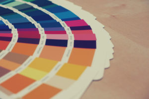
Color Palettes Matter
Having the right color palette can make or break a brand’s identity. While it can be challenging to nail a color palette for a new brand, it’s important to understand the full impact that colors can have on the way a brand is perceived by consumers. It’s like deciding on the type of personality you’re going to have or if you should really dye your hair that vibrant shade of pink. Your brand’s color palette says a lot about who you are before you even have the chance to speak for yourself. The right place to start is the basic 12 slice color wheel. Selecting a traditional color or two from that wheel can open your imagination to the color options that might be the right fit for your brand visually, but you should also consider their psychological meanings as well.
Depending on where you are in the world, colors can convey different meanings, like purple symbolizing royalty and orange representing enthusiasm (get the full breakdown of color psychology here). It’s crucial to have a clear understanding of where your brand is going to have a presence, how your prospective consumers think and what color schemes your competitors are using when you’re putting together a color palette of your own.
-
Typography Sets the Tone
Ever walk through a store and notice that every brand has its own, recognizable font? The can of Coca-Cola sitting on your desk is masked in white swirls, while the iconic Nike swoosh is often accompanied by bold, block letters. Every brand in your life has a carefully crafted typeface that, along with the color palette, sets the tone for its identity.
Typefaces will vary based on the type of product or service the brand is offering. For Coca-Cola, they might be selling you a soda pop, but their brand essence is a gateway to enjoying time with family and friends with the accompanying feeling of joy. For Nike, the brand is designed for athletes. Athletes value strength, bold moves and power. Having a simple yet bold logo with emphatic lettering is exactly what they needed to get their message across to their target market.
If you’re designing for a presentation or a website, you may also want to consider using two typefaces that can work together to emphasize the right points of your message. These can be similar to what you use in your brand’s logo, or completely different. Whatever you choose, always make sure it’s representing the value and purpose of your brand.
-
Blank Space is Your Friend
A major faux-pas of non-designers is trying to fit too many elements into a design. This results in a final project that is too overwhelming to look at. Although you might think that one poster needs 62 off-white circles, a novel’s worth of copy and five shades of blue text, I can say with confidence that less is definitely more when it comes to design.
Blank spaces are the sections of the design that allow the background to shine through. Blank space is important to design because it allows other elements of the creative to be emphasized, such as a brand’s logo or slogan. While this might look empty to some, blank space is necessary to have a balanced, easy-to-comprehend piece of work. Rule of thumb: if your eye is drawn to something other than the main message of the design, there’s too much on the page.
-
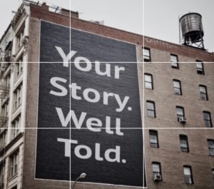
The Rule of Thirds
This is one of my favorite rules of design because it combines logic with art. The Rule of Thirds works by first placing a 3×3 grid over your design. You then need to look for the points where the lines intersect – these are where the focal points of your design should be placed.
Focal points are the parts of the design that you want your viewers to be drawn toward. These can be anything – from a logo, to a person, to an object – but they should always be the elements that help get your overall message across to your audience. Take this LHG advertisement for example – the words align with the focal points so that the viewer’s eye is drawn to them.

-
Composition is Key
A symphony orchestra is more than just one outstanding cellist – it’s the result of horns, violins, percussionists, etc. complimenting the sounds of one another to produce a tune that simultaneously surprises and delights an audience. Design works the same way.
A great design is the result of many components working together to get a message across. This can simply be great copy layered over the right color palette with some geometric shapes added for good measure, or it can be more elaborate with custom graphics, animations or special filters layered on. For a non-designer looking for a quick creative fix, my recommendation would be to keep the composition clean and balanced – no one likes when a violin is playing loud and out-of-tune.
While a background in the arts is always helpful for design projects, we know that budgets and timelines don’t always account for enlisting the help of professionals. Implementing these tips on your next project can help amplify your designs and put your best creative foot forward.