A logo is a fragile thing. And yet, it bears the entire weight of the brand it represents. The make-or-break tipping point is miniscule. A logo that’s too beholden to a designer’s personal artistic sensibilities won’t cut it. A logo that’s beautifully designed but fails to speak to the brand’s core value won’t succeed. On the other end of the spectrum, a logo that’s poorly designed will fail regardless of whether it reflects the brand’s core value or not. It bears repeating: a logo is a fragile thing. The best way to give your logo the best chance at survival is to have it professional designed based on a deep and true understanding of your business, your mission, and your audience.
Not So Fast
Many famous and memorable logos have a sublime simplicity that makes them appear as if they were serendipitously and effortlessly plucked out of thin air. Would that it were so simple. The logos—good ones—that look as if they required the least amount of time to create most assuredly took much time and toil. That’s not to say a good designer can’t come up with an initial idea in a matter of minutes for what, once refined, will become a final logo. But in such rare instances, it is crucial to know and to remember that it took years (maybe even decades) of diligent work and effort to fuel such seemingly instant bursts of inspiration.
There are legends of famous logos that were hatched instantly on a cocktail-napkin or scrap of paper. Well, they are just that. Legends. My continual search over the years for proof of any famous (read, “memorable and enduring”) logo done in such haste has yielded a single find: the I Love New York logo.
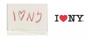
In 1976, Milton Glazer used a red crayon to sketch the idea on the back of an envelope while sitting in the back of a taxi. Although it’s not technically a logo (more about that in a bit), the phrase is a remarkably effective visual brand ambassador for the Big Apple.
There are innumerable lesser-known logos that were born that same way. We’ve all seen hundreds of them throughout our lives whether we realized it or not. But the chances that we saw them for very long are woefully low. The phrase “speed kills” definitely applies in the realm of logo design.
Let’s look at a recent, real-world example of a hastily done logo. Below is the new logo the Chargers NFL team unveiled in conjunction with announcing their move to Los Angeles from San Diego.
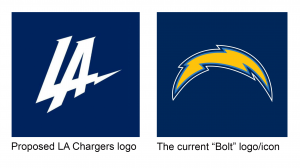
The only thing that seems to have happened faster than the logo’s design was the backlash. Fans, non-fans, designers, casual observers, even other NFL team owners jumped all over the logo. It ignited a maelstrom of disapproval and harsh critique in the Twittersphere and inspired memes of satirical overhauls of the design that went viral in a flash. The most confounding issues from a branding perspective are A) that the team would consider abandoning the iconic “bolt” they’ve had since 1974, and B) even if they were considering updating or replacing a logo with more than 40 years of equity, the endeavor deserves more attention than the 40 minutes they seem to have spent. The existing logo is already among the most recognizable in the NFL and is not linked or tied visually to any specific city. It wasn’t broken, so why the jump to fix it? That’s a question those in the Chargers organization were forced to ask themselves in the wake of the logo’s scathing reviews. Here’s the answer they gave just two days after releasing it:
“The logo that was revealed on Thursday was meant to help launch our brand into the market and supplement—not replace—our official team marks,” Chargers president of business operations A.G. Spanos said in a statement provided to Pro Football Talk. “Clearly, we miscalculated how the logo would be received, and we’ve taken it out of the rotation.”
~ Mike Florio, ProFootballTalk.NBCsports.com
Not sure I buy Spanos’ explanation of intent, but I do believe the organization made the absolute right move in acknowledging the public’s reaction and taking action to amend the misstep. The mantra of branding guru Marty Neumeier is, yet once again, apropos: “Your brand is not what you say it is. It’s what they say it is.”
When a Logo Isn’t a Logo
Earlier, you read that the I Love New York logo isn’t technically a logo. It’s true. And I’ll tell you why.
We in the business, just like the public at large, regularly use the word logo incorrectly. Yes, it’s probably lazy on our part, but the term has become an acceptable catchall. Everyone knows what’s meant when the word logo is used. But, in truth, everything we call a logo is actually a brand mark. And here are the correct names for the different types of brand marks:
- Symbol
This is a graphic element with no name, words, or initials. Classic examples of marks are Apple’s apple and the Nike swoosh. Marks are usually most successful for brands with ample funds to spend on advertising to establish an association of a stand-alone graphic with the brand it represents.
- Wordmark
Stylized text that spells out the company or brand name. Custom fonts are often created specifically for wordmarks. Well-known examples include Disney, the Coca-Cola script, and Facebook. Some may include integrated and relevant graphic elements in the letterforms, such as the arrow in FedEx, the pin-tip on the bottom of the letter P in Pinterest, and the 31 worked into the BR of the Basking Robbins wordmark to represents their 31 flavors.
- Lettermark
Akin to a monogram. A lettermark features the initials of a company or brand name, some within a shape or with stylized typography. Examples: IBM, Hewlett-Packard, and Warner Brothers.
- Combination mark
The pairing of a wordmark with a symbol. This type of brand mark allows for the use of either or both elements across different applications. When well designed, a combination mark works well visually whether the elements are together or separate. Examples: Sprint, Lacoste, and Adobe.
- Emblem
The company or brand wordmark or lettermark within a defined shape, such as a circle, square, or shield with or without accompanying graphic elements. Examples: Harley-Davidson Motorcycles, UPS, and Starbucks.
So what type of logo do you have? If you don’t have one, why haven’t we spoken? And if the one you have is outdated or no longer reflects the essence of your brand, we can help with that as well.
Have questions or want to see how Lou Hammond Group can help brand your business, product or service? Contact us today.